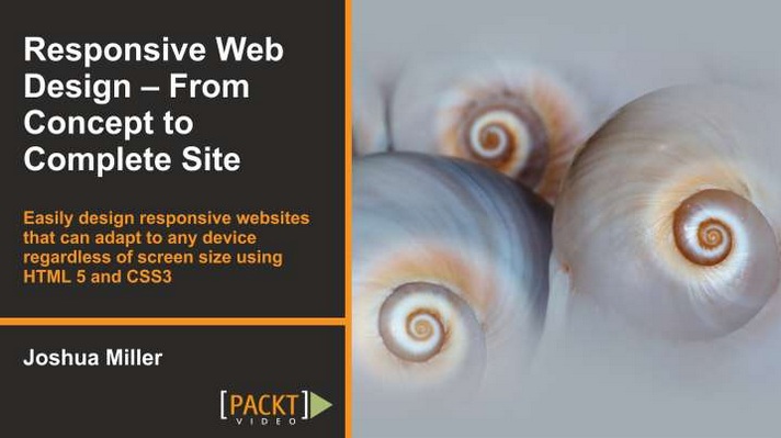
packtpub - Responsive Web Design – From Concept to Complete Site
English | mp4 | H264 1280x720 | AAC 2 ch 129 kbps | 2 hrs 5 min | 378 MB
eLearning
What you will learn from this video course - Build a responsive site from start to finish, from mockup to HTML and CSS implementation
- Understand the advantages and disadvantages of RWD compared to other web design techniques
- Learn to build a fluid layout starting from a digital mockup
- Create breakpoints in a layout and write the code to modify the layout of your site at each breakpoint
- Understand techniques to test and maintain your responsive code on different devices
- Format headers, footers, and column layouts in a way that will adapt to different browser sizes
- Target specific viewports to present an optimized view of your website for a given device
Who this video course is for Have you been writing two websites – one for mobile and one for larger displays? If so, this course will show you how to make your website responsive, in order to be fluid enough to adapt to any and all the different devices available. Basic knowledge of HTML and CSS will prove helpful for jumping into this video series.
In Detail There’s never been a greater range of screen sizes of tablets, smartphones, and even televisions and associated web view user experiences to consider. Web pages being built to be responsive provide the best possible version of their content to match the viewing devices of not just today’s devices but tomorrow’s too. This course walks you through crafting responsive websites that provide an optimal viewing experience on any device using HTML5 and CSS3.
By following this structured video course, you will learn how to convert fix-width layouts to responsive layouts, contain a fluid layout with maximum or minimum properties, write syntax for a media query, select breakpoints, write HTML to embed all the saved elements into a page, and add CSS to your site ensuring that you have the skills to create your very own responsive website quickly and efficiently.
Responsive Web Design – From Concept to Complete Site starts with an overview of the technology, the best practices to follow, and then moves on to a complete implementation of a responsive site using HTML5 and CSS3 media queries. After learning the essentials of responsive web design in the introductory section, you will walk through splitting a mockup into images and content areas, defining a fluid grid using those divisions, creating a percentage-based layout for the fluid grid with CSS, and then begin creating a full-functional responsive page. The latter section contains hands-on exercises that will walk you through all the HTML5 and CSS3 code required to build your sample page.
This course ends with an overview on the future of web design, the features you can use today, and tips on how to remain current in the field.
 Table of Contents
Getting Started with Responsive Web Design [12:22 minutes]
Exploring Responsive Web Design (RWD)
Understanding the Use of RWD
Examples of Adaptive Layouts
Device Breakpoints
Pros/Cons of RWD
Course Overview
Building a Fluid Layout [5:41 minutes]
Fluid Width Layouts
Working with Percent Width Layouts
Examples of Fluid Layouts
Media Queries [10:56 minutes]
Media Queries
Media Query Code
Testing a Simple Media Query
Best Practices for Media Queries
Testing Media Queries on Actual Mobile Devices
Building Our First Responsive Page [4:12 minutes]
Using RWD Demo Files
Using Sample Files
HTML5 Structure for Our Site [14:59 minutes]
Overview of the HTML Structure for the Demo Site
CSS Resets and HTML5
HTML for Container, Header, and Navigation
HTML for a four Column Content Area
HTML for a two Column Footer
CSS for Our Site [27:05 minutes]
Using Demo CSS for our Site
Writing the CSS for the Navigation Bar and Logo
Building the CSS for Navigation and its Elements
Tweaking the Navigation Using the Inspect Element
Formatting the Header
Styling the Columns
Formatting Headings and Images in the Columns
Formatting the Footer
Tweaks and Fixes to the Body Layout
Adding Media Queries to Our Fluid Layout [18:20 minutes]
Planning for Media Queries
Tablet Media Query for the Body
Using Media Query for the Navigation Bar and Logo
Using Media Query for the Navigation Bar and Logo for Devices Smaller Than the Tablet
Using Media Query for Columns to Reorient Horizontally
More on Column Queries and Footer
Final Tweaks for Phone-Sized Devices
Advanced Features/Considerations for the Future [31:17 minutes]
Advanced Features/Considerations
Dealing with Font Size EMs
Using Percent-Based Fonts and Dealing with Problems with EMs and Percent
Demo of EM and Percent-Based Font Sizes
Solution to Issues with REMs
Future Considerations: VM, VH, VMAX, and VMIN
Current Solutions to Text Size Issues and Responsive Background Images
Using Background Images, Adaptive Images, and Bandwidth
Responsive Grids
CSS Pre-processors
Screenshots:
Download File Size:363.68 MB
 |
|