2015
Lynda
Bill Shander
1:31
English
As a data analyst, you probably already know how to build visualizations and use tools like Excel and Illustrator. This course challenges you to go beyond the data, beyond the software, and start thinking more clearly and strategically about the foundations of great communication design. Bill Shander, founder of Beehive Media, focuses on the key challenges analysts face trying to communicate complex information, and how visual communication can help. He breaks down ten key components of great data visualizations—built in any program—and shows innovative ways of rethinking the slides, charts, diagrams, and templates you work with every day.
Introduction
Welcome
1. Why
Meeting today's critical communications challenges
Visual perception
2. Visual Communications in 12 Easy Lessons
Story
Headlines
Color
Axes, labeling, and legends
Scale
The right data
Picking the right chart
Exploring chart options
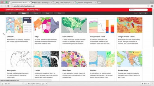
Tools
Sketching and wireframing
Simplification - KWYRWTS
What about leave-behinds, smart guy?
3. In Practice
Rethinking text-based slides
Rethinking some charts
The power of simplification: Convincing your bosses
Conclusion
Next steps
Download File Size:271.67 MB