2014
Train Simple
2:15
English
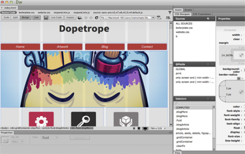
With the wide array of devices accessing your site, it's typically a good idea to make your information as accessible as possible to different screen resolutions. Over the past couple years responsive web design has become a standard in web techniques. Dreamweaver CC has a Fluid Grid Layout feature that affords you the ability to create fully responsive sites, quickly, visually, and effectively. This course explores what you need to know about responsive design, and how to implement it in Dreamweaver using this feature.
1. Understanding Responsive Design
Welcome
Examples of Responsive Web Design
Understanding Fluid Grids
Fluid Grid Formulas
Understanding Media Queries
2. Setting up a Fluid Grid Layout
Create a Fluid Grid Layout
Modify Columns in the Layout
Exploring the Dependent Files
Organize Your Files
Understanding the Golden Grid System
Add Fluid Elements
3. Creating a Fluid Grid Layout
Explore the Completed Layout
Setting up the Project
Adding a Header
Making the Heading Responsive
Adding a Background Image
Inserting the Navigation
Styling the Navigation
Making the Navigation Responsive
4. Completing the Layout
Inserting the Main Banner
Adding Sub Banners
Making Sub Banners Responsive
Adding Buttons to the Sub Banners
Creating a Blog Post Section
Styling the Blog Post Section
Making the Blog Section Responsive
Adding Another Blog Post
Adding a Footer
5. Wrapping up the Site
Making Adjustments to the Layout
Creating Secondary Pages
Dealing with Orientation
Pitfalls to Avoid
Final Thoughts
Download File Size:546.39 MB
 |
|